Budget vs. Actual analysis: Create, Update, Present
Setting up a spreadsheet plus reporting system for Budget vs. Actual analysis is time consuming, requires a great number of manual actions and a lot of attention to details to ensure numbers and formulas are error-free and the visualization is insightful. In addition, you need either to have multiple columns or worksheets (one for Budget, one for Actual and one for Variance), complicating the structure and the scalability of your workflow.
The Old Way of Doing Budget vs. Actuals Analysis
The classic way to do this is preparing a forecast based on input drivers in a worksheet. For example a forecast like this:
Then we need to create two copies of this worksheet, call it “Actual” and “Variance”, and then:
- Plug actual numbers as they become available;
- The Variance worksheet will update and you will be able to create the charts and analysis you need:
Another common template is to create, for each period, 3 columns: Forecast, Actual and Variance. There are more ways to do this depending on personal taste, but they are some variants of the two described above.
It Is Not Only About the Spreadsheet
Preparing the spreadsheet is only the first step. Stakeholders might have a hard time understanding the spreadsheet and would prefer an insightful, visual comparison of Budget vs. Actual figures. This means charts have to be created and added to a presentation which, in turn, has to be shared with stakeholders via some communication channel, e.g., Power Point over email.
Complexity and error probability grow with every step.
For instance, what if you’ve spotted a formula error or a wrong assumption after you’ve created the presentation (or, even worse, after you have already sent it)? You’ll have to go back to the spreadsheet, fix the error, copy paste charts to your email or presentation and send again.
With Visyond, you can quickly set up Budget vs. Actual analysis that is maintainable, easy to update and to present to stakeholders in a visual, comprehensive way.
Step 1: Create the Budget scenario
Set Up the Spreadsheet
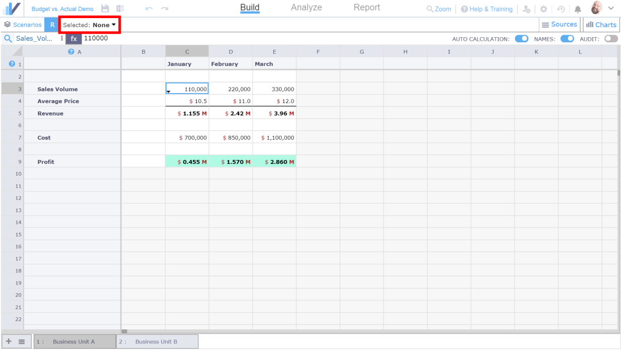
When you start working on your spreadsheet, you will see that there is no scenario selected by default. In other words, you will see the Default values of the spreadsheet:
Create the Budget Scenario
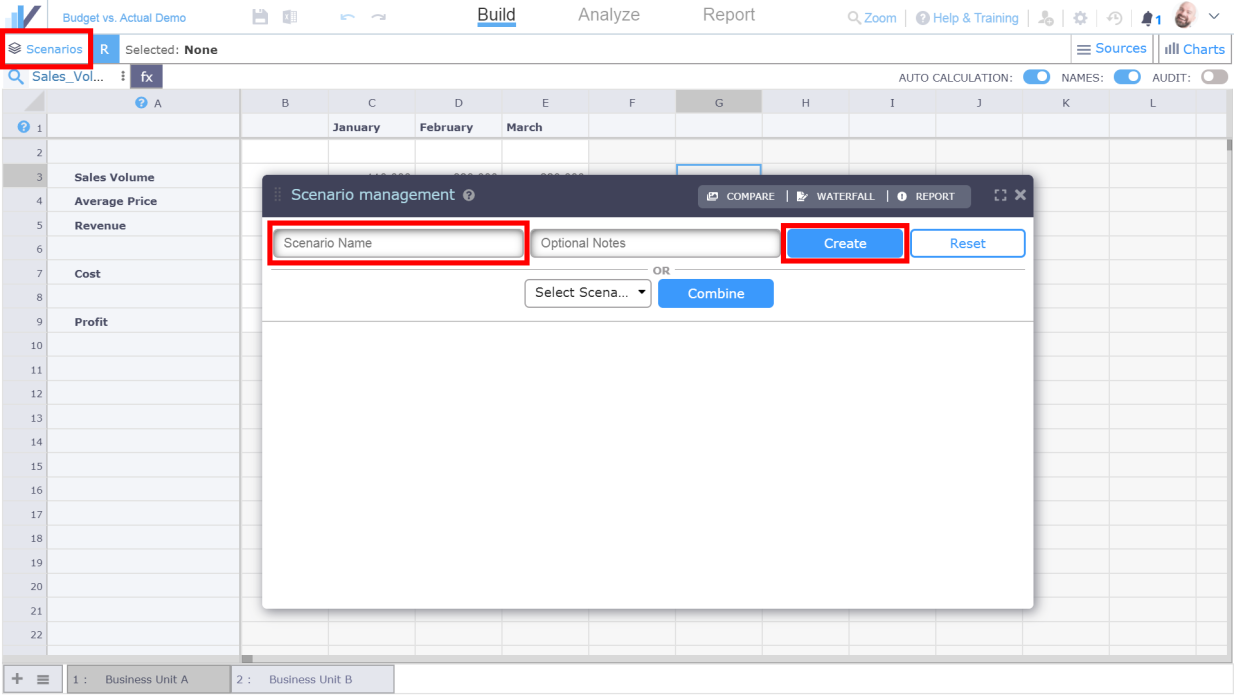
Now, let’s create the Budget scenario. Since the spreadsheet has some Default values already – they will become the base for our Budget scenario. To create a new scenario, click the Scenarios button to open Scenario Management panel, enter the scenario name – “Budget” – and click the Create button:
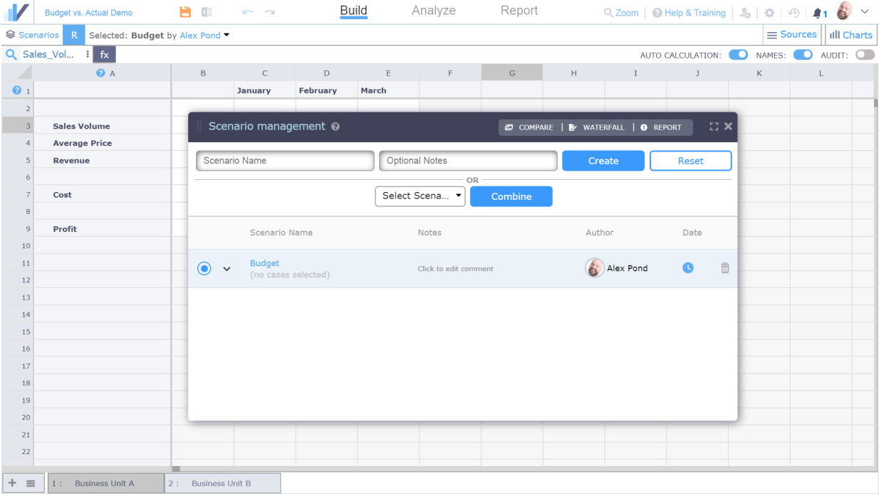
Visyond will create the Budget scenario that will use the Default spreadsheet values (a snapshot):
Learn about Scenarios in Visyond
See this article to learn more about how Scenarios work in Visyond.
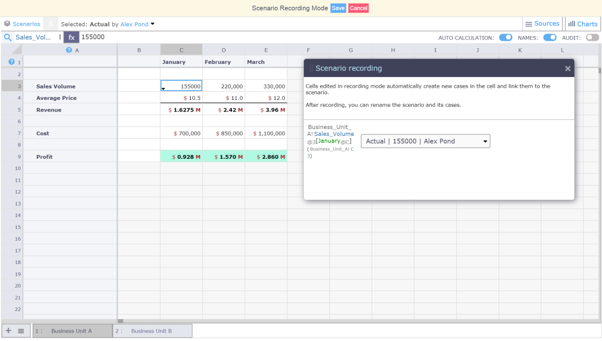
Step 2: Create the Actual scenario
Now let’s create the Actual scenario by clicking on the “Create” button on the top bar.
Edit the cells, and the new values / formulas will be automatically linked to the active Actual scenario. In this example, we modify Sales Volume for January (cell C3). After you’ve updated the cell, click the Save button:
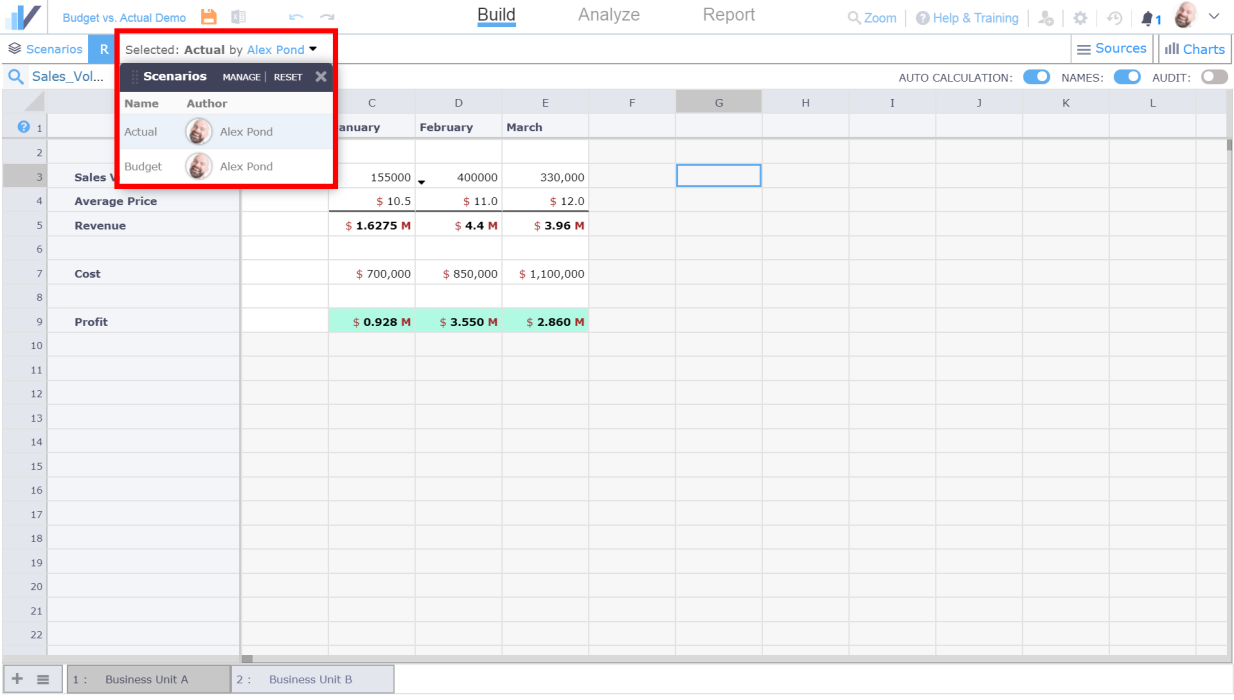
Switching between Budget and Actual scenarios
You can create as many scenarios as you want and switch between them at any time – Visyond will recalculate the formulas based on the values in the selected scenario. You can quickly switch between scenarios in the Scenario Panel on the top of the screen:
What if you need to update the Budget scenario?
Let’s say that you want to make changes to the Budget scenario based on the insights from the previous period’s actuals. To do this, you will simply need to switch to the Budget scenario and update the cells.
What if you need other people to enter data without your supervision?
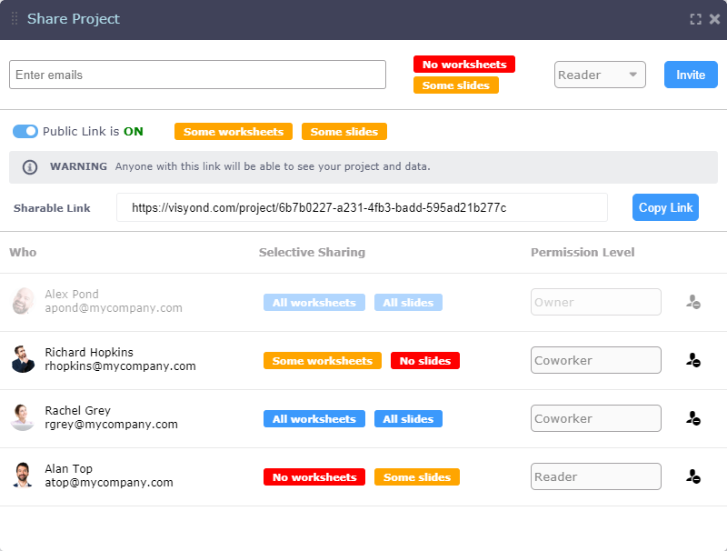
You can invite collaborators to add their own assumptions (for example, the Actual figures) without exposing sensitive or non-relevant information. See this article to learn more about how you can securely share only specific worksheets with specific collaborators.
You don’t have to worry about collaborators overwriting/deleting the values or scenarios created by other people or breaking formulas that you’ve worked so hard to set up. One of the core Visyond’s principles is that nobody can’t accidentally or on purpose change other people’s work. See this article to lean more about how Visyond stores multiple assumptions in the same cell without overwriting.
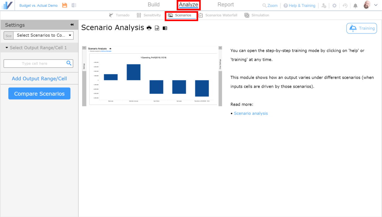
Step 3: Generate Budget vs. Actual comparison chart
Creating the Scenario Comparison Chart and Table
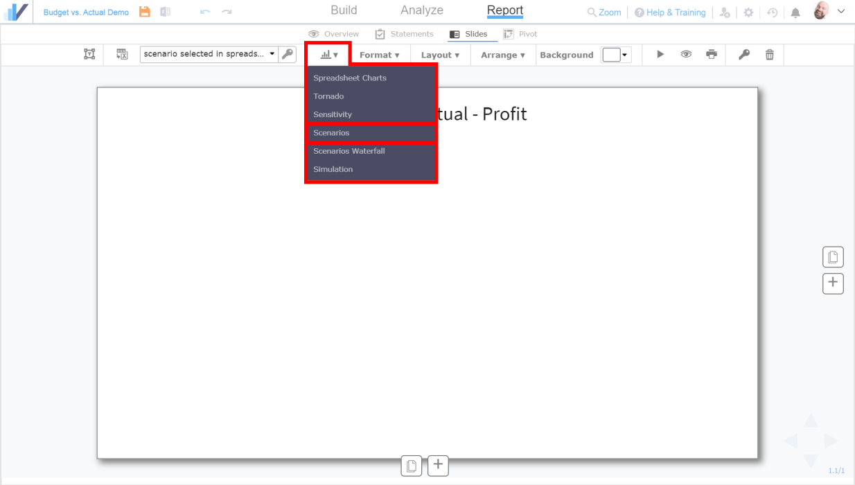
At this point, we have two scenarios – the Budget scenario and the Actual scenario. Time to compare them! Go to the Analyze tab, and then to Scenarios tab:
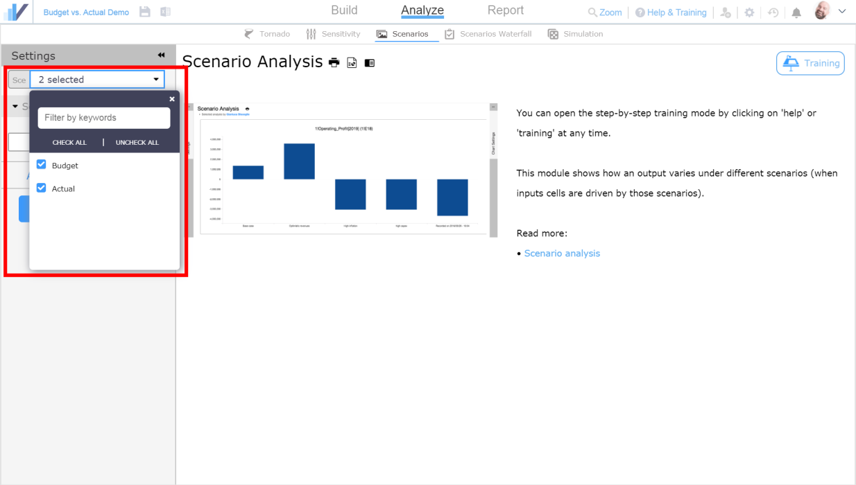
Select scenarios that you want to compare in the drop-down window:
Pick the cell or a range of cells that you want to compare by clicking the magnifying glass icon:
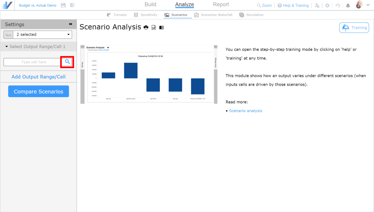
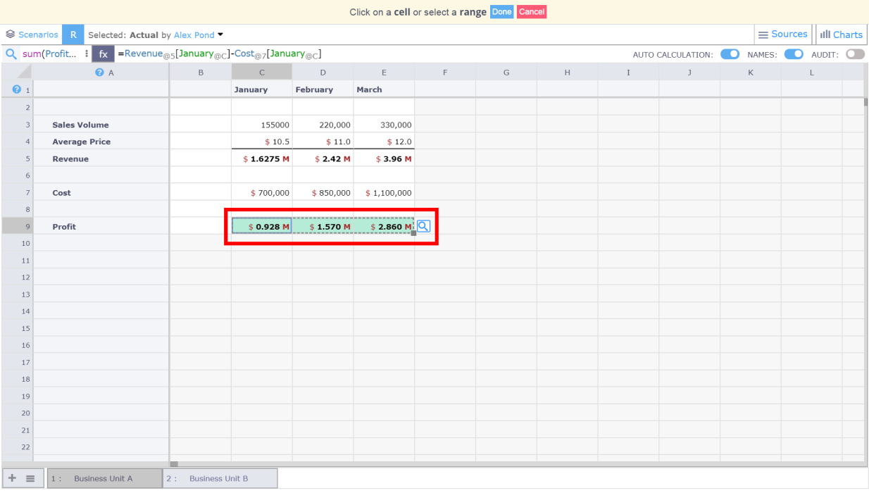
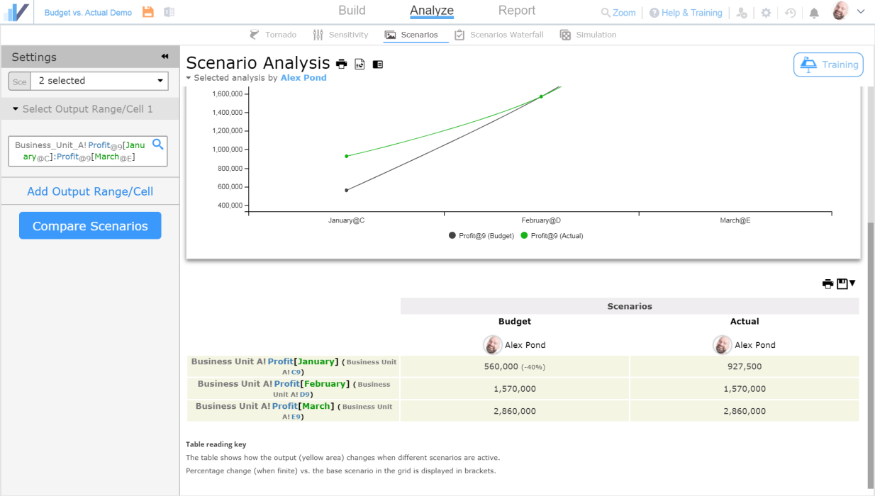
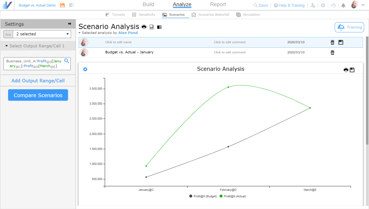
You will be taken to the spreadsheet where you can select a cell by clicking on it or a range of cells by selecting the range. Let’s select the range that includes Profit for January, February and March (range C7:E7) and click the magnifying glass icon to pick up the range:
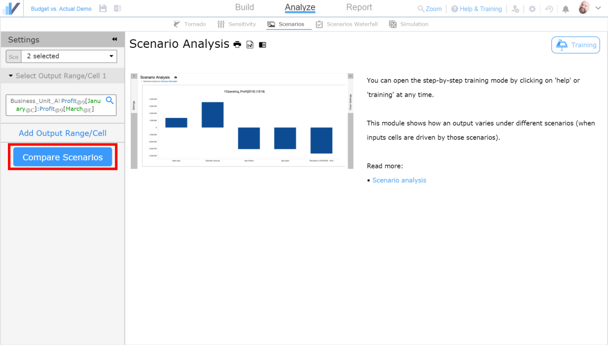
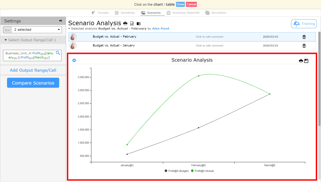
Once you’ve picked the range, you will be taken back to the Scenario Analysis tab. Click the Compare Scenarios button:
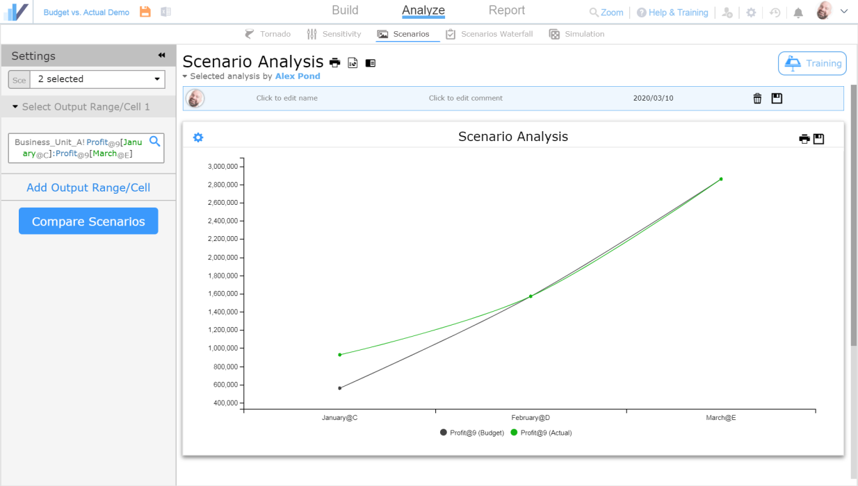
Visyond will generate a scenario comparison chart. As you can see, the lines on the chart converge on February and March – this is because there is yet no actual data available for these months. If you don’t want to see the converging lines on the chart, you can simply modify the output range that the chart uses and remove the months (February, March) that don’t have the actual data available yet:
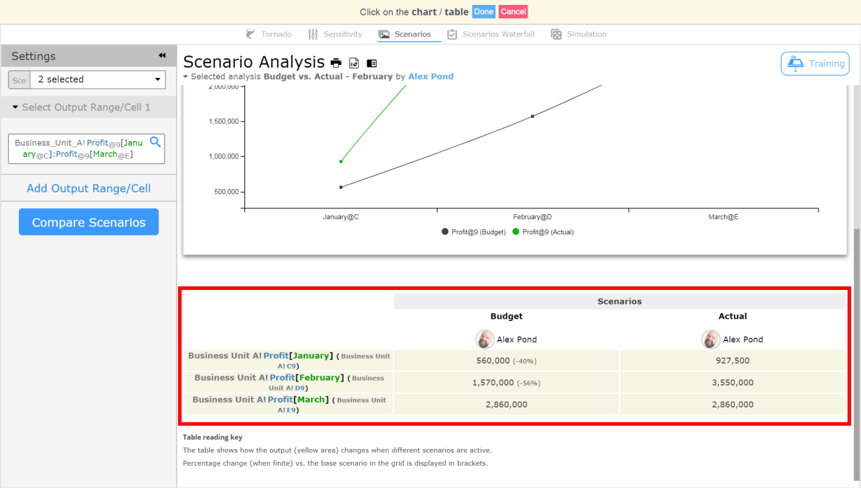
And the cell comparison table below the chart:
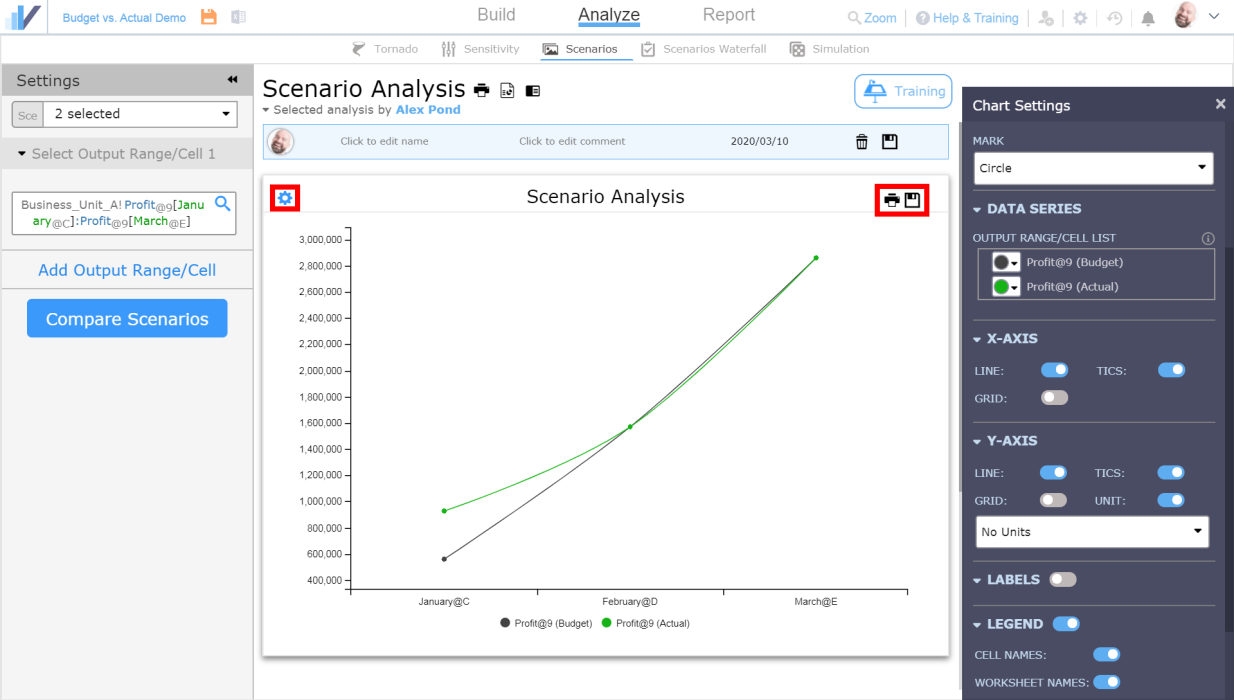
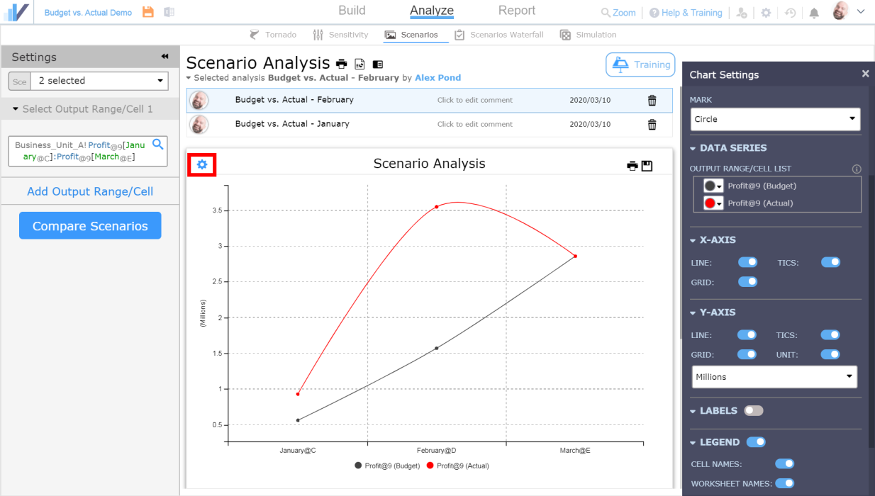
Customize the Chart
You can customize the chart’s appearance by clicking the gear icon on the chart, as well as print the chart (and the comparison table) or save it by clicking the corresponding icons:
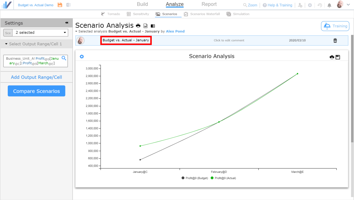
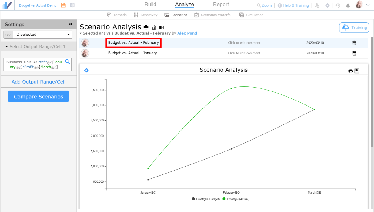
Name the Scenario Comparison
Now let’s give our scenario analysis a name, and save it:
Besides Budget vs. Actual, there are many ways to use Scenarios
See this article to learn more about how to do Scenario Analysis in Visyond.
Step 4: Update the Actual scenario and chart with new data
Updating the Actual Scenario
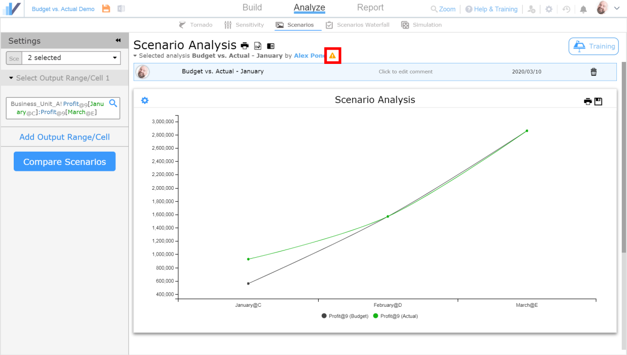
Let’s say we have just received the figures for Sales Volume in February, and we need to update our Budget vs. Actual analysis with them. This means we will need to update the Actual scenario and the comparison chart. First, let’s get back to the spreadsheet, switch to Actual scenario and edit the update the value of Sales Volume for February (cell D3). That is it!
Updating the Scenario Comparison Chart and Table
Not let’s get back to the Scenario analysis tab. Notice how the warning icon appeared next to the analysis that you’ve previously made – this means that there were changes in the spreadsheet since the last time you’ve ran the analysis.
Since we have all the parameters (scenarios and cells to compare) already set up, we only need to press the Compare Scenarios button to re-run the analysis. Visyond will create new and updated scenario comparison chart. The lines on the chart converge in March because there is no actual data available fro March yet:
Let’s give a name to the new scenario comparison chart:
Any collaborator can update Budget vs. Actual analysis
When you run your analyses, other collaborators will be able to view them (but they can’t modify or delete them) or they can create their own analyses without overwriting the existing analyses.
Keep the Actual Scenario Up-to-date
Repeat Step 4 (extend scenarios and re-run scenario analysis) every time you update the Actual scenario with new data points accordingly or if you need to update the Budget scenario.
Step 5: Create the Budget vs. Actual dashboard
Create New Dashboard
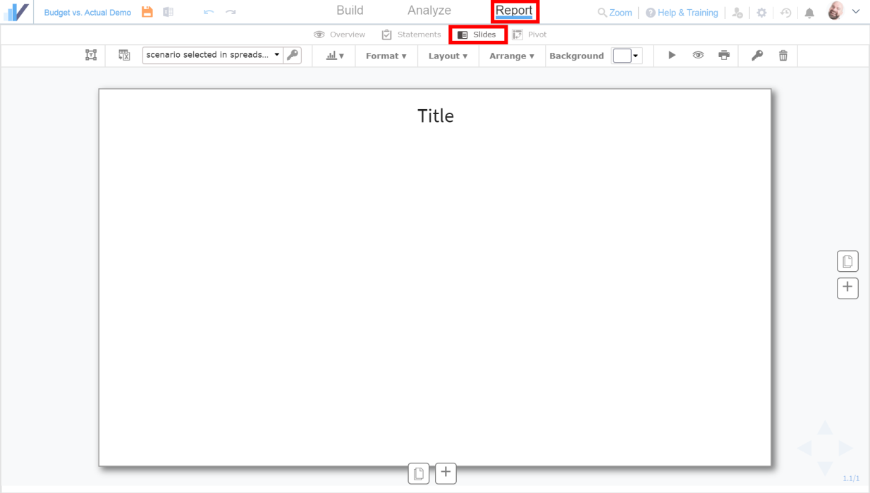
Now let’s create a dashboard that we can later present to stakeholders and decision makers. Go to the Report tab and then to Slides.
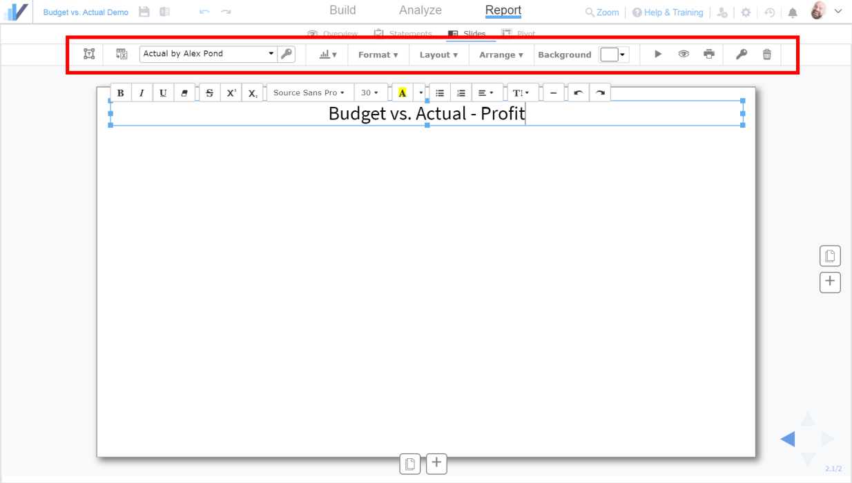
Customize the title by double clicking on it and edit the slide to your liking (i.e. change background color or add text) using the panel above the slide:
Add Chart and Table to the Slide
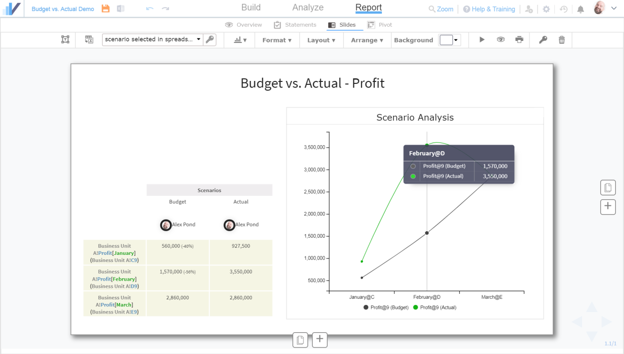
Click the Add charts button and select Scenarios:
Here, you will pick a chart or a cell comparison table to add to your slide. For now, let’s add the Scenario Analysis chart by clicking on the chart itself:
The chart will be added to the slide. Now click the Add charts button and select Scenarios again but this time click on the table below the chart to add it to the slide:
Make The Slide Look Nice
Arrange the elements on the slide (or use one of the Layouts):
Add Additional Data to the Slide
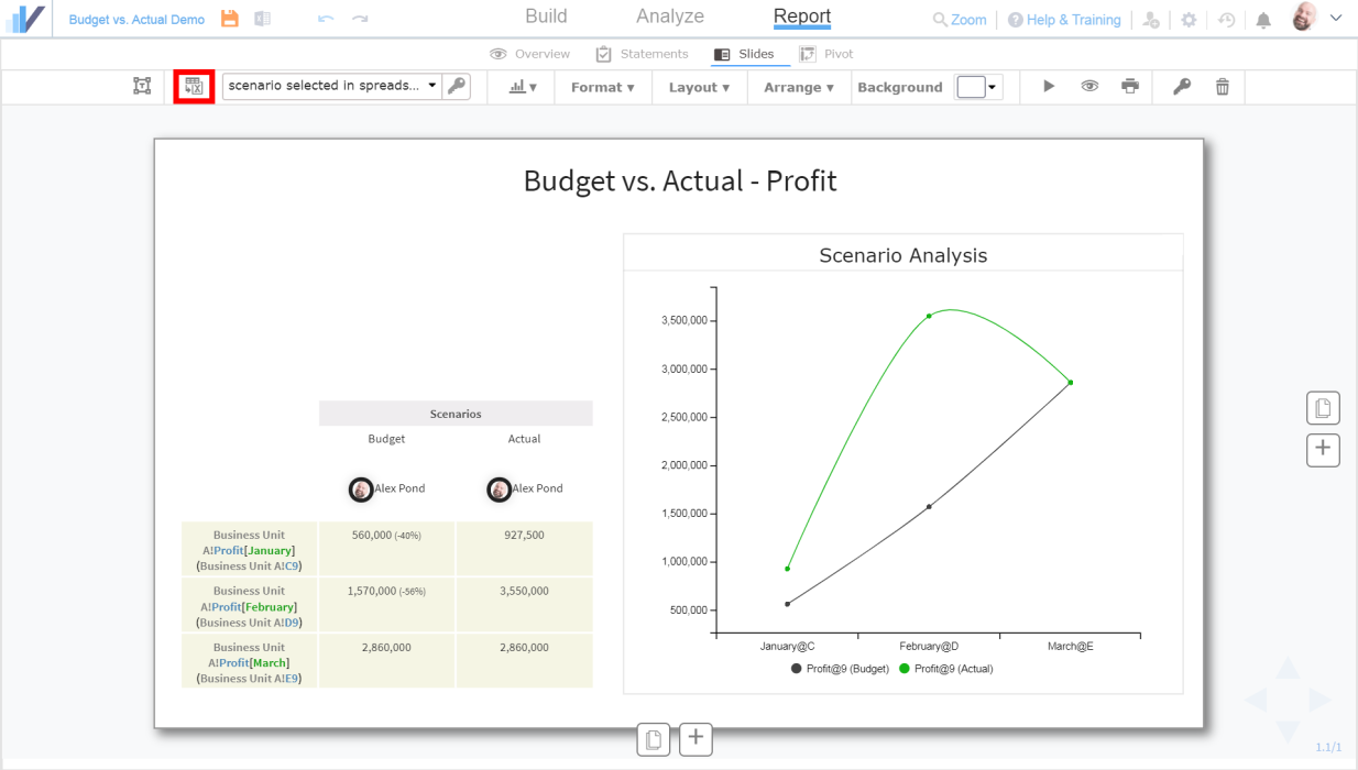
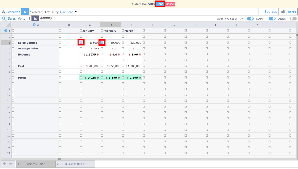
Looks great, but something is missing – it would be nice to see the figures for Sales Volume on the same slide. To add them, let’s add the cells directly from the spreadsheet into the slide by clicking the Select Spreadsheet Cells button:
And selecting the cells we want to add to the slide by clicking on the corresponding tick-boxes. Once you’ve picked the cells, click Done:
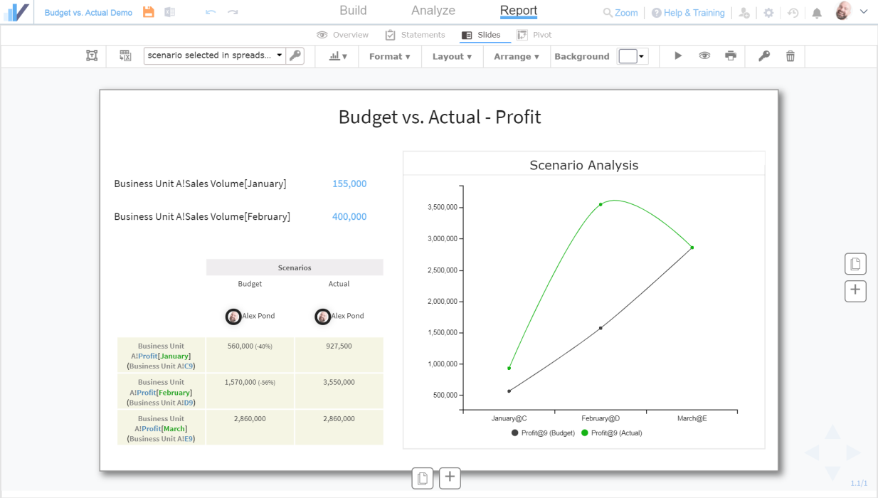
The cells and their values were added to the slide but their names are worksheet and cell references which might not look very nice during presentation:
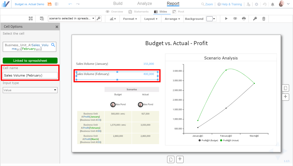
Let’s change their names by clicking on the ‘cell box’ on the slide and renaming them in the panel that appears on the left side:
Switching Scenarios in the Slide
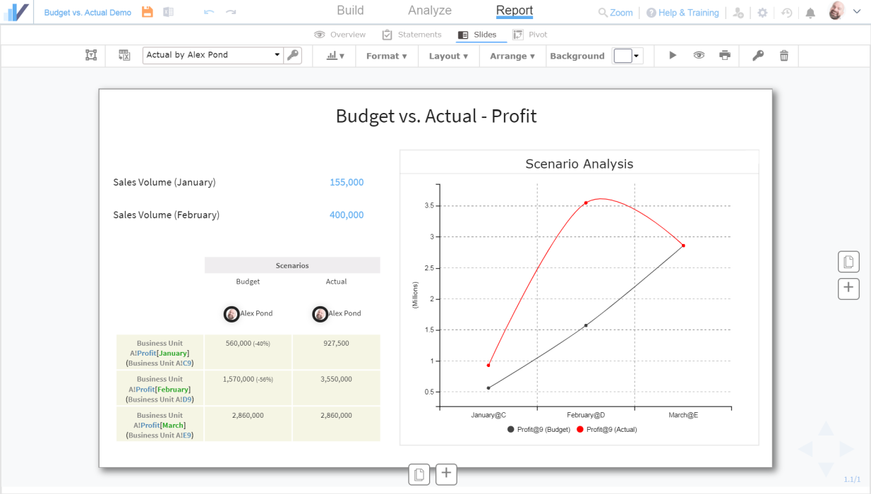
The values for Sales Volume come directly from the spreadsheet’s currently active scenario (in our case – the Actual scenario). You can switch scenarios directly from the slide and see the corresponding cells and charts change:
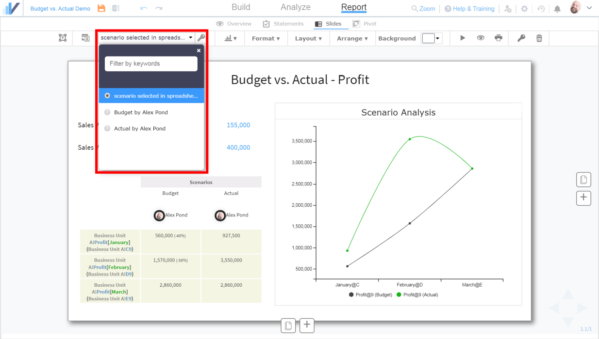
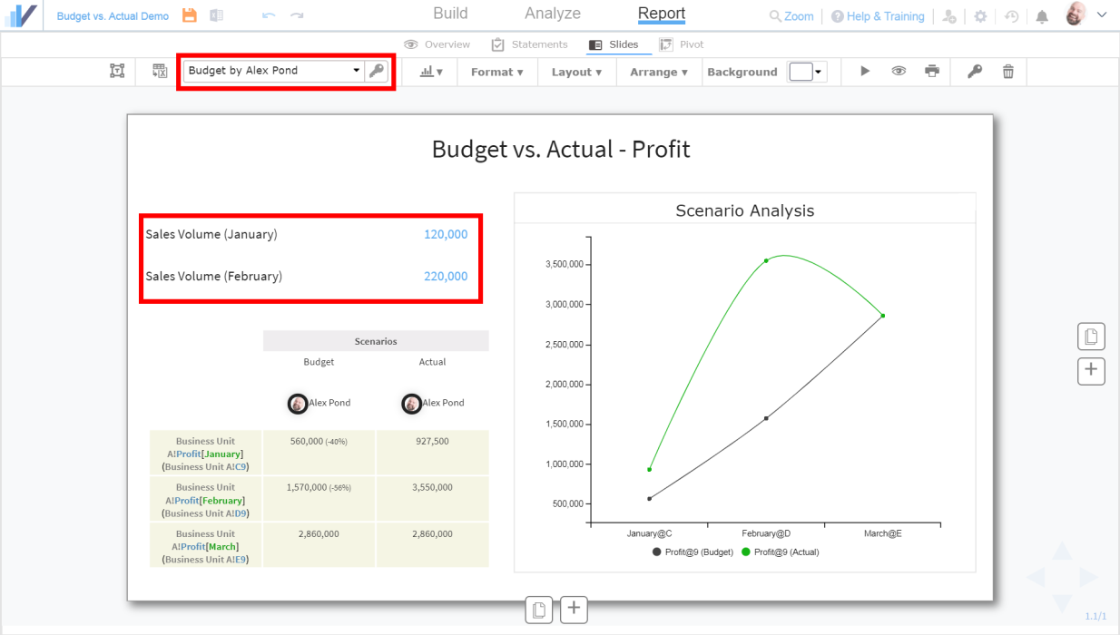
If you select the Budget scenario, you will see that the cell values for Sales Volume update according to the selected scenario. Note that in this particular example, the chart and the comparison table will not be updated because the comparison is static.
Changing and Customizing the Chart
Note that if you go back to the Analysis tab and customize the chart’s appearance (i.e. colors, grid lines, etc.), the slide will pick up the updated chart automatically:
Learn more about Slides and Interactive Presentations in Visyond
See this article to see how to create insightful Interactive Presentations in Visyond.
Step 6: Share the Budget vs. Actual presentation slide with stakeholders
Now the slide is ready to be shared with stakeholders – you can let them see only this specific slide (without exposing the spreadsheet and other information).
See this article for more information.