In Visyond, you can easily create a chart online, with many different chart types and customization options.
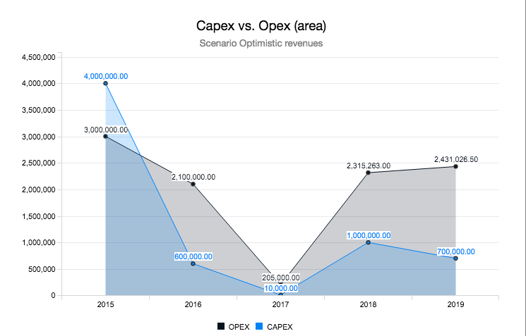
Even Waterfall charts are created instantaneously and, like any other bar chart, its data series can be grouped and stacked by drag&drop (see below).
Creating a New Chart
You can create online and always up-to-date charts in Visyond in two ways:
- By selecting a range;
- By clicking on the Chart button, and then clicking on the New Chart in the chart pane.
Creating Charts from a Cell Range
You can also create a chart by selecting a range in the grid and clicking on the chart button of the range selection panel.
Click on a cell, hold down the Shift key and use the arrow keys to select a range. Click on the chart icon in the pop up box and pick the type of chart from the drop down menu.
Creating Charts using the Chart Pane
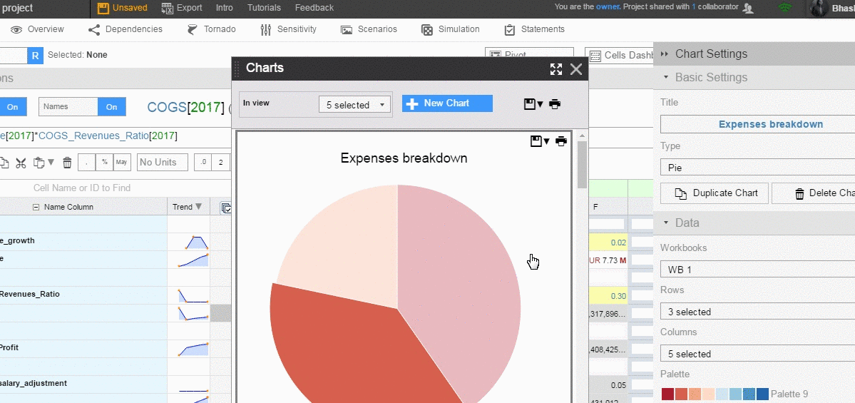
This will open up the Chart Settings side-pane where you can configure your charts by selecting, for example, the rows and columns to chart.
Once that is done you can now configure your chart to make it look like how you want from the Chart Settings panel.
Working with the Chart Settings Panel
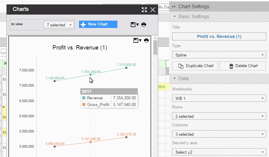
The default chart type is Vertical bars but some other chart types that you can choose are:
- Vertical Bars
- Vertical stacked bars
- Horizontal bars
- Horizontal stacked bars
- Scatter
- Line
- Area
- Spline
- Area Spline
- Step
- Area Step
- Pie
- Donut
- Waterfall
- Gauge
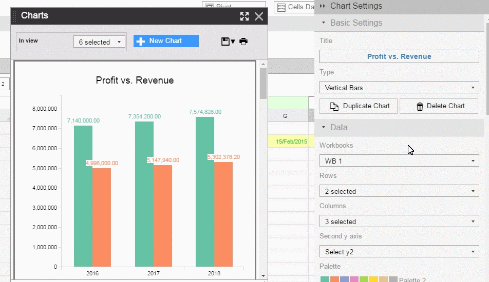
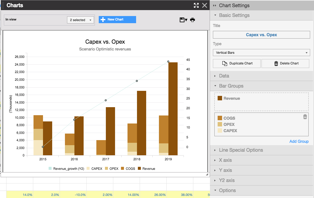
From the basic settings you can also delete or duplicate a chart.
Changing type for Specific Data Series
You can assign a chart type to each data series: right-click on any data point of the series and select the new type. This gives you even more options for visualizing data.
In this example I have created a bar chart off a data point in a spline chart.
Selecting Data to Chart, Switching Axes, Adding a Second Axis
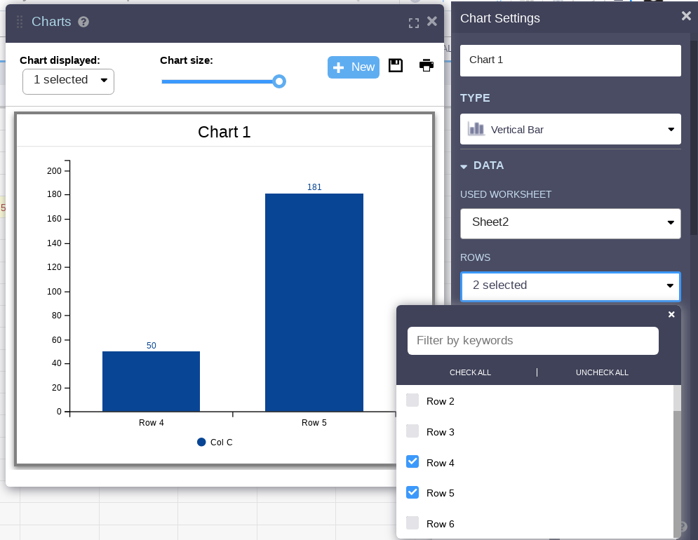
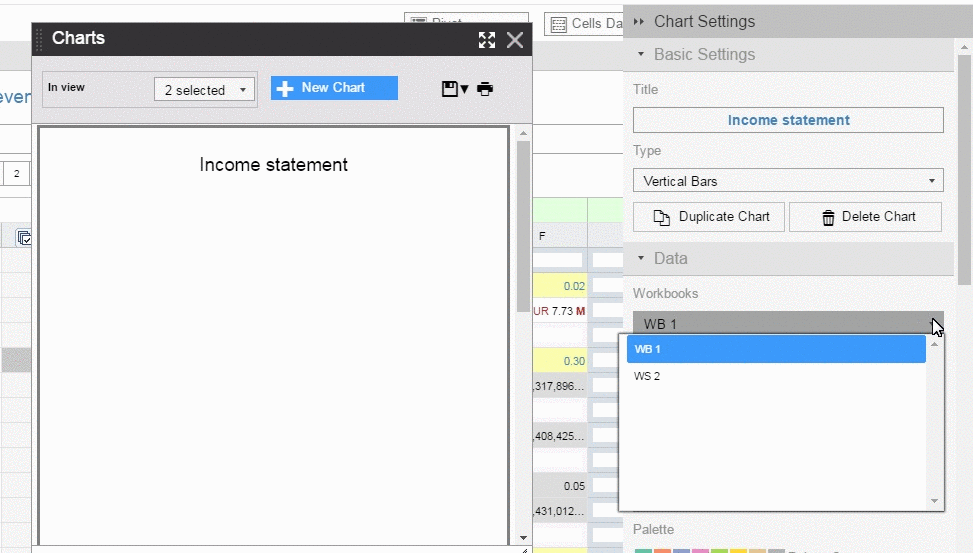
Select the workbook where your data lives and the rows and columns you want for your chart. It’s super easy to pick rows and columns: simply click on the dropdown menu and tick on the relevant check-boxes.
Tip: Instead of scrolling up and down to select the check-boxes for the rows and the columns simply type the keywords for the row/column in the Filter by Keywords text box.
Unless you are working with donut and pie charts you can create a second Y-axis for your charts.
You can also swap axes with a single click using the Swap Axis button.
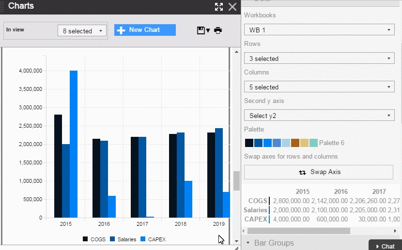
Visually Slicing and Dicing Data using Groups
With groups for bar charts, you can easily cluster bars by dragging and dropping different data points into groups.
Here’s how it works:
- In the Chart pop-up window click on the chart you want to edit.
- In the Chart Settings sidebar, scroll down to the Groups menu.
- Add new groups and drag the bar data series (other types obviously cannot be grouped).
- Observe how the bars rearrange to fall into your desired groups.
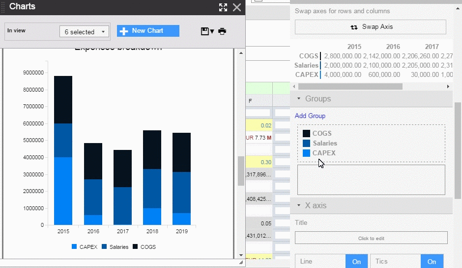
You do not need to manually rearrange cells to get better data analysis and visualization.
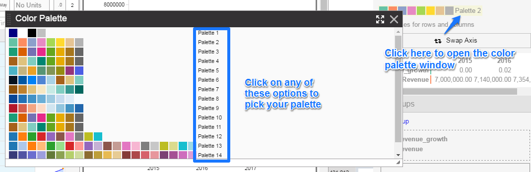
Colors and Branding
For personalization, you can select different color palettes.
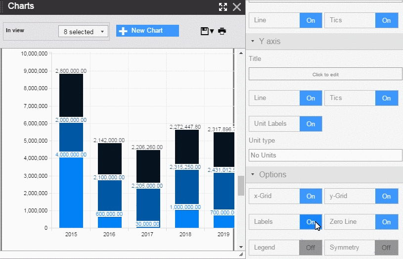
Customizing Your Chart
You can further customize your chart by adding labels, ticks, units, legends, etc. from the Chart Settings menu options.
Organizing Your Charts
All the charts that you create will be added to the Charts pop-up window from where you can select different charts to display, print, save, or use in presentations.
Use the drop-down menu near the top right to select the charts that you want to see. 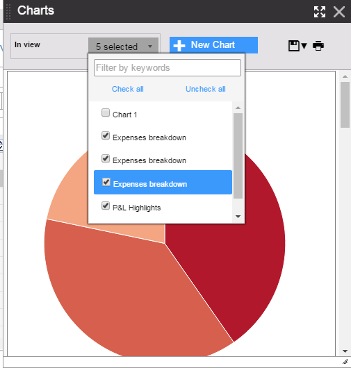
Click on the Save icon on the top right of the Chart pop-up window to save all the charts. If you want to save individual charts you will see the option once you mouse-over near the top right of each chart.
You get two options to save charts:
- Save them with white background.
- Save them with a transparent background.
These charts will be saved to your computer as PNG files which you can copy paste to Word or PowerPoint.
Printing charts in Visyond is simple: just click on the Print icon on the top right of the Charts pop up window to print all the displayed charts.
You will be able to see the print preview: once you are satisfied with the layout and size just click on Print, or Cancel to go back to your dashboard.
If you want to save these charts in PDF format, click on the Print button which opens your browser’s native print and save as PDF preview.
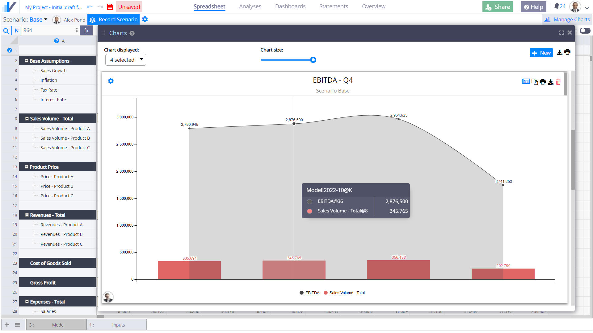
Note how charts display the active scenario: no confusion on which assumptions were selected when the chart was printed.