Waterfall charts are a great tool that can help you visualize how a starting value is affected by a series of positive and negative contributions as well as show the transition in value of an indicator that is subject to positive or negative changes over time.
Waterfall charts can be useful in many situations – from visualizing financial statements to changes in profits and operating costs over time.
With Visyond, you can easily create Waterfall Charts online in one click and securely share it with collaborators. All charts are in sync with the spreadsheet and presentation slide so you don’t have to maintain or manual updated them if underlying data changes.
Prepare Data for your Waterfall Chart
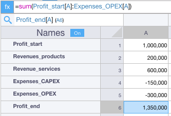
In this example, we want to visualize the contribution of revenues and expenses and then group them by category. Type names in the “Names” column to benefit from Visyond’s Natural Names.
Select the Data and Hover on the Sandwich Menu
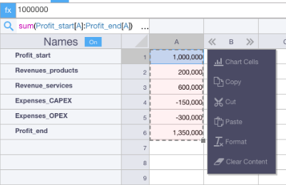
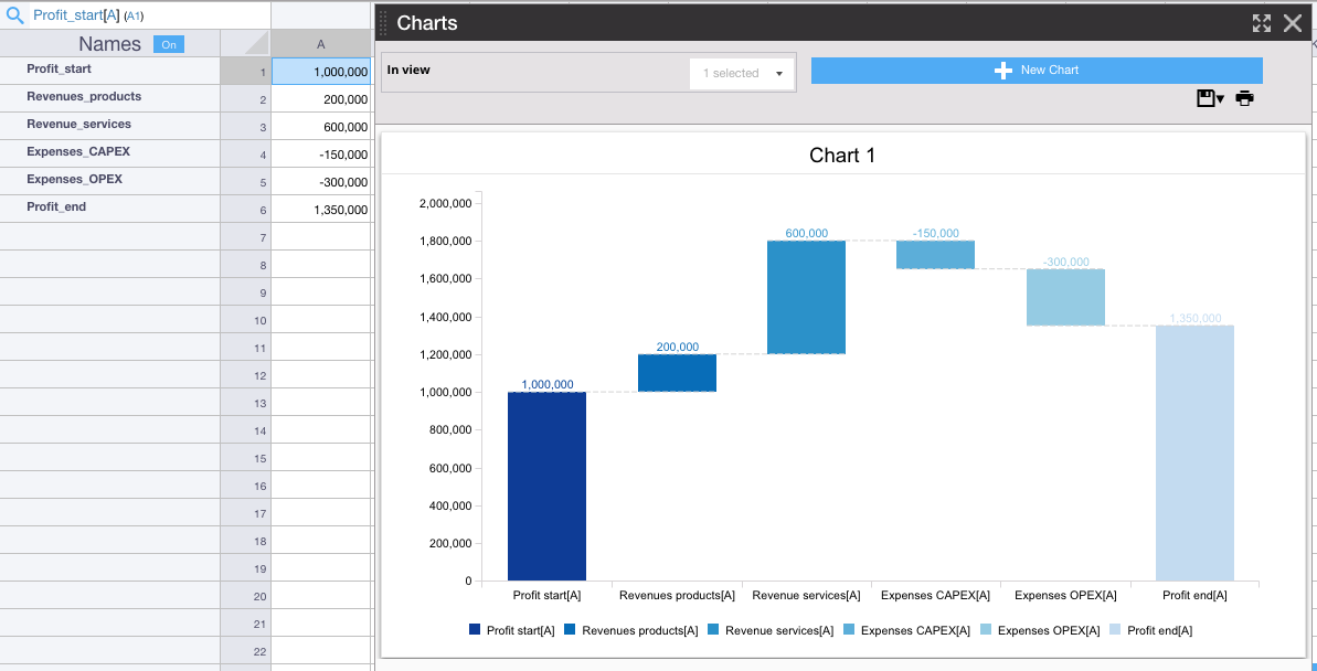
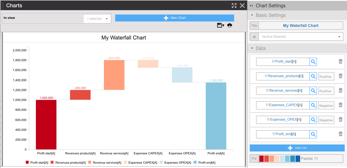
Click on “Chart Cells” and Select “Vertical Waterfall”: Your Chart is Now Ready!
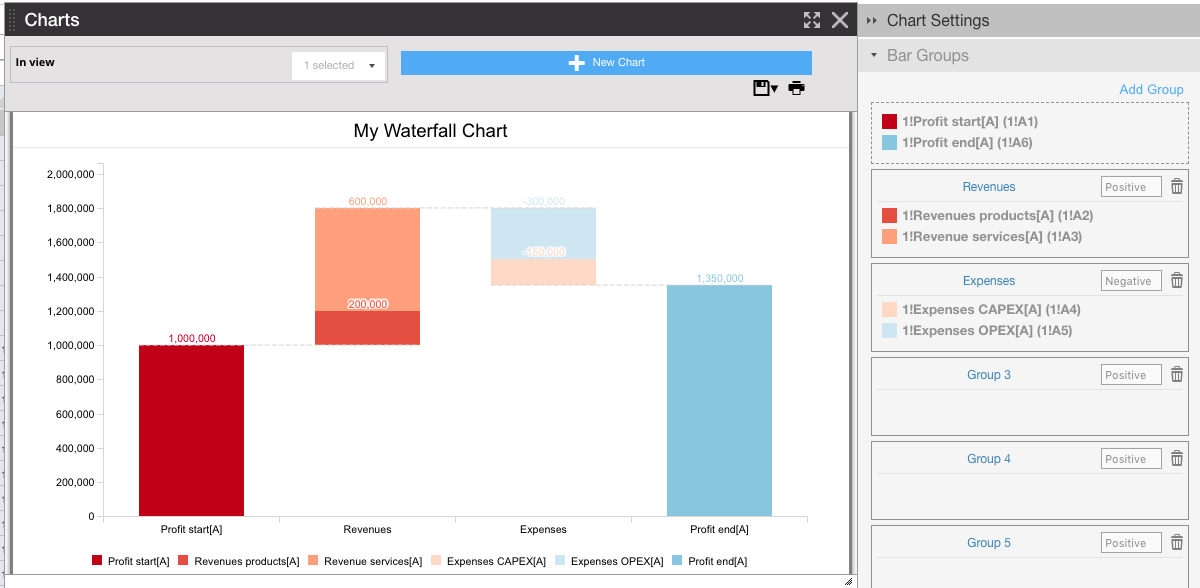
Customize and Create Groups of Bars
Click on the Watefall Chart to open its Settings Panel, customize it and group bars.
For example, you can:
Customize a look and feel of your Watefall chart
Change the title and palette:
Group Data inside Waterfall Chart by Category
Drag all revenues into a group called Revenues, and all expenses into a group called Expenses