New User Interface
Visualizing your spreadsheet models as predictive dashboards, automating financial statements and running what-if and risk analyses has become even easier with the new updated user interface. This is the first one in the series of improvements we have planned to enable you to get answers from your Excel models even faster.
To learn more and see the important changes, check out the highlights here.
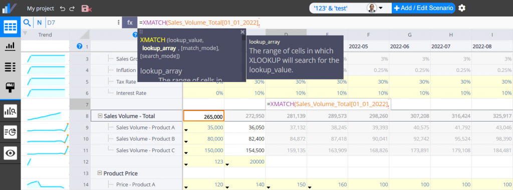
XMATCH and XLOOKUP functions support
Visyond’s Excel-like experience is now even more Excel-like now that you can use the XMATCH function and import Excel spreadsheets containing it. Happy modeling!
Spilled range operator (e.g., =SUM(A2#)) and Implicit intersection support (e.g., =@INDEX(A1:A10,B1))
Visyond now supports the latest Excel syntax for dynamic arrays:
Troubleshooting
If you are experiencing any issues, please clear your browser cache:
If you still experience issues, please contact us here or reach out via chat on the website.
Important look & feel improvements
Navigation and Main Menu
Navigation between modules has been moved to the side bar.
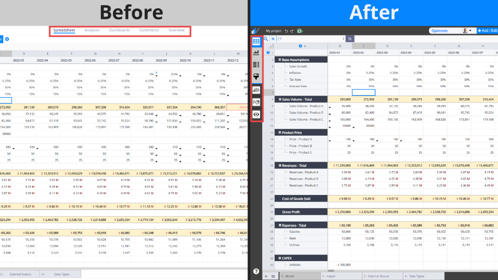
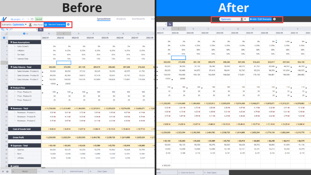
Scenario Switcher
Scenario switcher has been moved to the top panel for better accessibility.
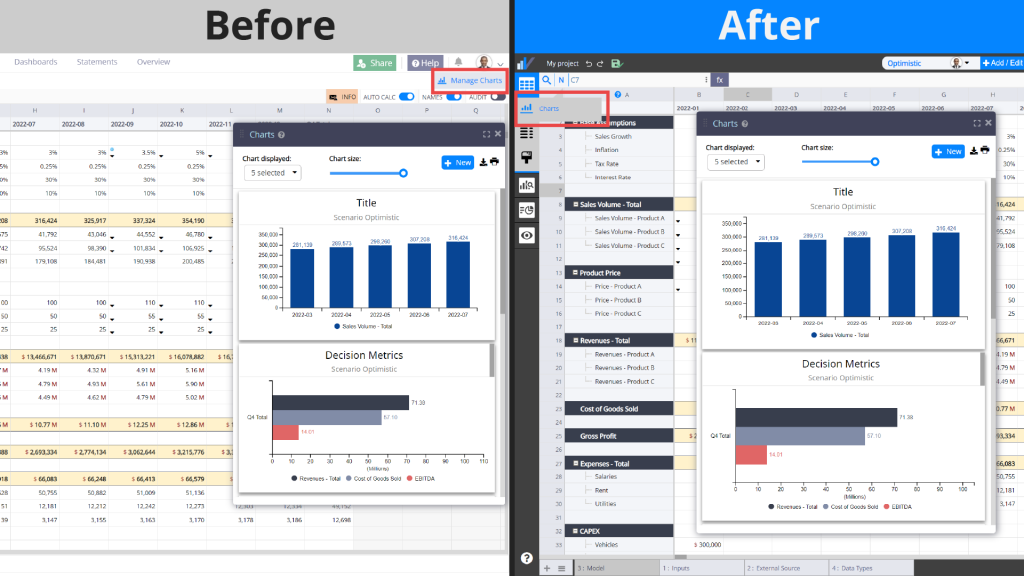
Charts
The Charts panel is now located inside the Spreadsheet menu.
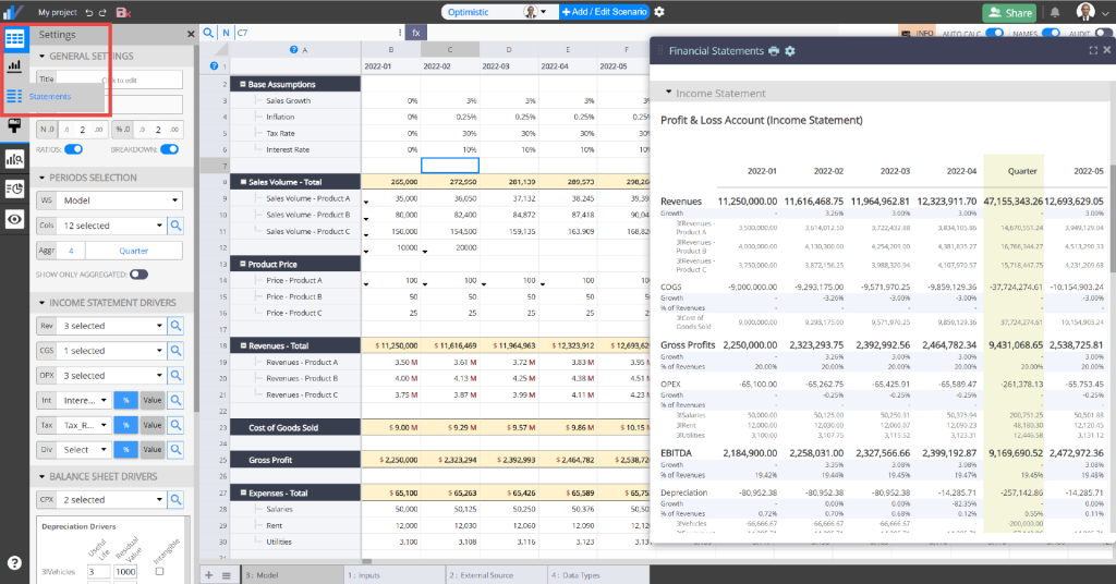
Financial Statement Generator
Financial Statements have been moved under the Spreadsheet category in the menu. The statements are now displayed alongside the spreadsheet so you can see both of them as you select rows and columns to be used in your statements (and watch the statements populate themselves!).
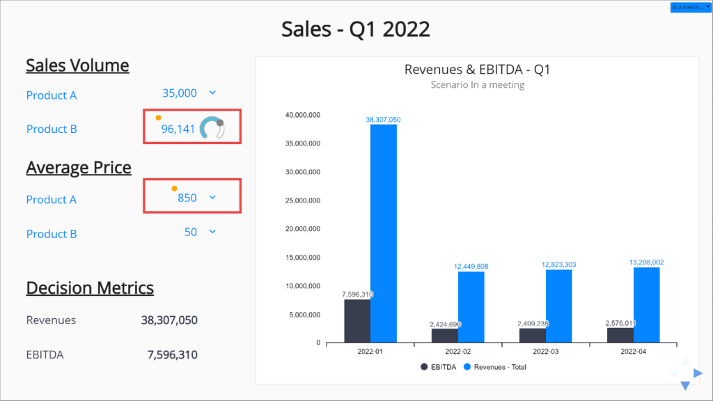
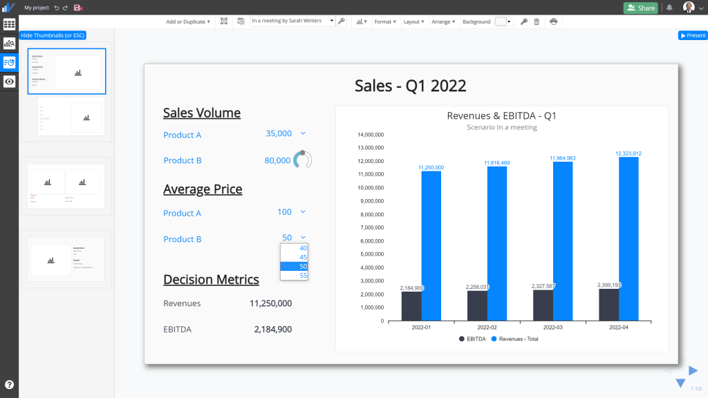
Interactive Dashboards
When testing assumptions and scenarios on interactive dashboards, values that you input and that don’t correspond to the currently active case in the spreadsheet are now marked with an orange circle to indicate that the cells exposed on the dashboard are in the ‘What-if mode’ (as opposed to ‘Linked to spreadsheet’).