How to run Sensitivity Analysis in Visyond
Visyond makes it extremely easy for you to run Sensitivity analysis on your models without navigating through complex menus.
What is Sensitivity Analysis
Sensitivity analysis is a technique for understanding the relationship between input and output variables in a model.
You can use it to simplify models by eliminating variables which has no impact on the outcome, understand how different variables interact with one another, and uncover errors in models.
In case of large models you can use Sensitivity analysis to isolate critical parameters and save time and effort by focusing only on them.
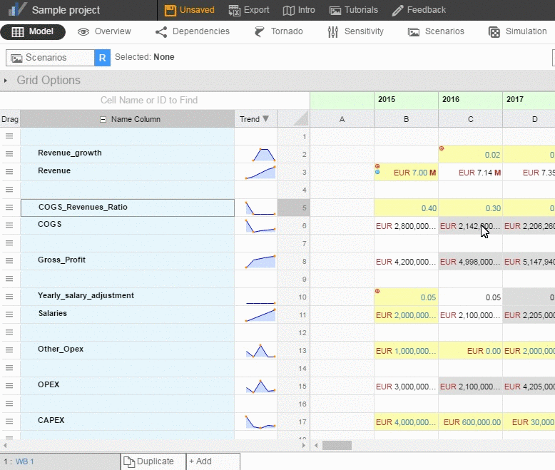
In Visyond you can either run One-Way Sensitivity analysis where only one input variable is changed, or run Two-Way Sensitivity analysis where two input variables are changed at the same time.
To get the best out of Sensitivity analysis, run it after Tornado analysis which will tell you which input variables are the most significant ones for a particular output cell.
Setting up Sensitivity Analysis
Click on the Sensitivity tab.
In the Settings window on the left, type the name of the Output Cell and Input Cell, or click on the “Pick cell from grid” button to select them from the grid.
You have two ways of selecting the data that goes into the Input cell:
- Select the Input Range button if you want to calculate for inputs over a specific range. Here you can choose the minimum, the maximum, and the number of intervals of the range.
- Select the Input Values button if you want to calculate for inputs against specific values. You can enter values, separated by commas or spaces.
To run a two-way sensitivity analysis select another input cell.
Click on the Run Sensitivity button to run the analysis.
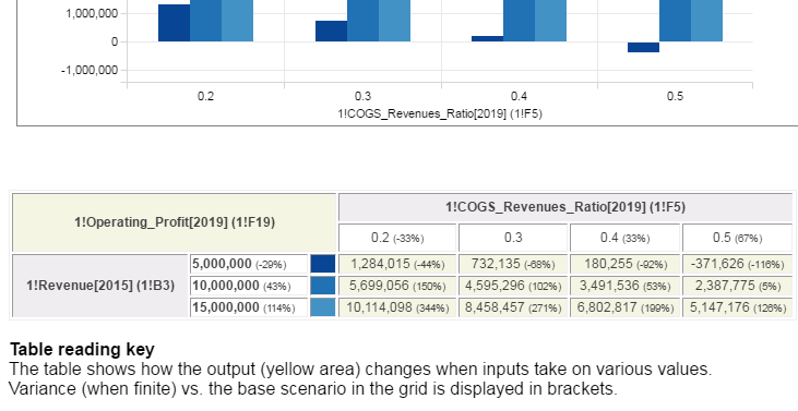
You will get a sensitivity chart and table with variances.
Customizing Sensitivity Charts
To customize the chart expand the Chart Settings side panel on the right.
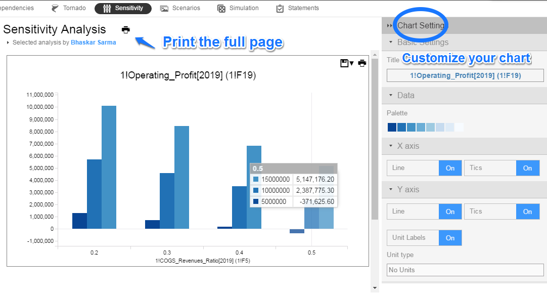
In the Chart Settings you can:
- Change the title of the chart (Basic Settings)
- Change the colors (Data)
- Toggle on/off Line and Tics (X-axis)
- Toggle on/off Line, Tics, Unit Labels, and add Unit Type (Y-axis)
- Add/remove grids, labels, zero line, legend, and symmetry (Options).
To save or print this chart hover your cursor near the top right corner.
Tip: Click on the inverted triangle next to the Save menu and choose to save the chart either with a white background or with a transparent background
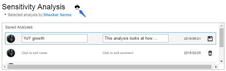
All Sensitivity analyses run by you or your collaborators are listed at the top, along with their names and optional comments, in a printable format.
Scroll down, and you will see the sensitivity table showing also the variances of the data points. There is also a table reading key which you can print out.
You can print the chart with the table in multiple formats for use in presentations and reports.